
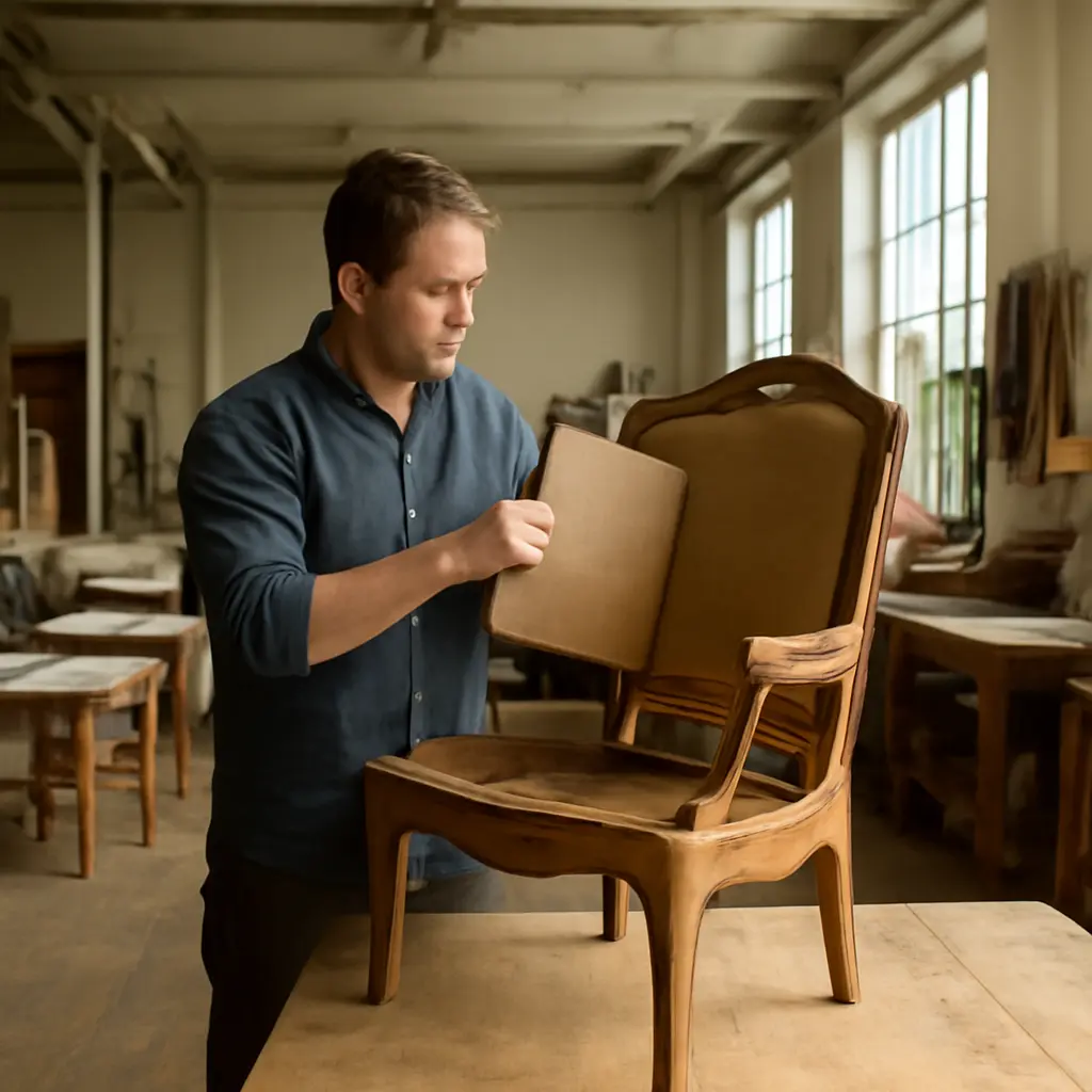
Old wood and fresh upholstery work together when their differences look intentional: let the wood bring age, texture, and visual weight, while the fabric adds comfort, color, and a sense of renewal. Five practical rules make the pairing easier: repeat a color, balance visual weight, coordinate undertones, mix textures with restraint, and test the combination in the room’s actual light. These choices matter beyond style—U.S. Environmental Protection Agency guidance notes that reusing and repairing products can help conserve resources and reduce waste, making an existing wooden piece worth considering before buying new.
Why Old Wood and Fresh Upholstery Work Together
Old wood and fresh upholstery are complementary interior-design materials. “Old wood” here means furniture with age, visible grain, patina, or wear; “fresh upholstery” means newly covered or recently updated fabric on a chair, sofa, bench, or headboard. The contrast gives a room both history and softness, provided the materials share a visual connection.
The pairing also supports a practical form of reuse: keeping a sound table, frame, or chair in service while updating the parts that affect comfort or appearance. The U.S. Environmental Protection Agency’s guidance on sustainable materials management emphasizes reducing waste through reuse and extending the useful life of products. The exact environmental benefit depends on the item, repair, and replacement choices, so restoration is best viewed as a thoughtful option rather than a guaranteed impact calculation.
Five Rules for Mixing Old Wood and Fresh Upholstery
1. Repeat a Color to Connect the Materials
A color connection is a repeated hue or related tone that makes separate materials feel part of the same composition. If a vintage oak chair has warm golden highlights, upholstery in rust, muted green, or creamy beige can echo that warmth. For darker walnut, consider deep blue, soft ivory, or a muted rose, depending on the room’s palette.
The upholstery does not need to match the wood exactly. Instead, repeat one color elsewhere—for example, in a cushion, rug, artwork, or lamp shade. This creates a bridge between the furniture and its surroundings without making the room feel like a coordinated set.
2. Balance Visual Weight
Visual weight is the impression of heaviness created by an object’s size, color, shape, and surface. A substantial carved frame can support a bold, textured fabric; delicate turned legs may look more harmonious with a lighter weave or quieter print. The goal is not equal visual weight in every object, but a balanced room overall.
Consider the furniture’s silhouette as well as its wood. A bulky sofa in a large-scale pattern can dominate a small room, while a slim antique chair may benefit from a more expressive fabric. Designers often assess furniture in relation to surrounding pieces and open space, not as an isolated sample.
3. Coordinate Undertones, Not Just Lightness
An undertone is the subtle warm, cool, or neutral cast beneath a material’s obvious color. Two finishes may both appear brown but still clash if one reads red and the other gray. Likewise, a pale fabric can look creamy beside honey-toned wood or stark beside a cool, weathered finish.
Compare wood and fabric in daylight and in the room’s evening lighting. The Illuminating Engineering Society explains that lighting conditions affect how colors are perceived; consequently, a swatch that looks harmonious in a showroom may shift at home. Test larger fabric samples against the furniture before ordering, and view them at different times of day.
4. Mix Textures with a Clear Hierarchy
Texture is the way a surface looks and feels—smooth, nubby, polished, matte, or distressed. Old wood often supplies visible grain and patina, while upholstery can add a contrasting tactile surface. Linen, velvet, bouclé, wool, and tightly woven cotton each create a different effect, so choose fabric according to the furniture’s character and intended use.
A useful rule is to let one surface lead and the other support it. Pair strongly figured wood with a calmer upholstery weave, or use a more expressive fabric against a simple wood frame. For everyday seating, check the manufacturer’s cleaning instructions, abrasion information, and suitability for the intended use; decorative appeal alone does not establish durability.
5. Respect the Furniture’s Age and Construction
The fifth rule is to update without erasing the piece’s character. Before reupholstering, inspect joints, springs, padding, and the frame. A sound frame may be a good candidate for new fabric, while unstable or damaged construction may require repair first. On historically significant or unusually finished furniture, consult a qualified conservator or upholsterer before altering original materials.
The American Institute for Conservation advises that conservation decisions should be guided by an object’s condition, materials, and significance. For an ordinary family chair, a practical refresh may be appropriate; for a rare or documented antique, preserving evidence of age can be more important than making the piece look new. In either case, avoid stripping or refinishing old wood simply to make it match the upholstery.
A Simple Method for Testing the Pairing
A small sample test helps turn the five rules into a confident decision. Use this checklist before committing to a full upholstery order:
- Photograph the furniture in the room where it will be used.
- Collect fabric samples in several textures and color families.
- Place each sample against the wood, then view it in daylight and evening light.
- Check the combination alongside nearby rugs, curtains, and painted surfaces.
- Confirm the fabric’s care requirements and suitability for the furniture’s use.
- Ask an upholsterer to assess the frame and internal components before work begins.
For example, a dark walnut dining chair with a simple frame might work well in a muted green or warm neutral fabric. If the chair has ornate carving, a restrained weave can keep the woodwork visible. The same wood paired with a high-contrast graphic print may also succeed, but repeating a color from the room helps the stronger choice feel deliberate.
Conclusion: Keep the Character, Refresh the Comfort
Mixing old wood and fresh upholstery is easiest when color, visual weight, undertones, texture, and the furniture’s history are considered together. Repeating a hue links the materials; balancing scale prevents one from overwhelming the other; and testing samples in real lighting reduces costly surprises. Most importantly, assess the piece’s condition and significance before changing it.
Start with a fabric sample and a careful look at the frame, then consult an experienced upholsterer when repairs or conservation questions arise. A thoughtful update can preserve a useful piece while giving it a fresh role in the room.
Sources: U.S. Environmental Protection Agency, Sustainable Materials Management Basics, https://www.epa.gov/smm/sustainable-materials-management-basics; Illuminating Engineering Society, The Lighting Handbook, https://www.ies.org/; American Institute for Conservation, Code of Ethics and Guidelines for Practice, https://www.culturalheritage.org/about-conservation/code-of-ethics